
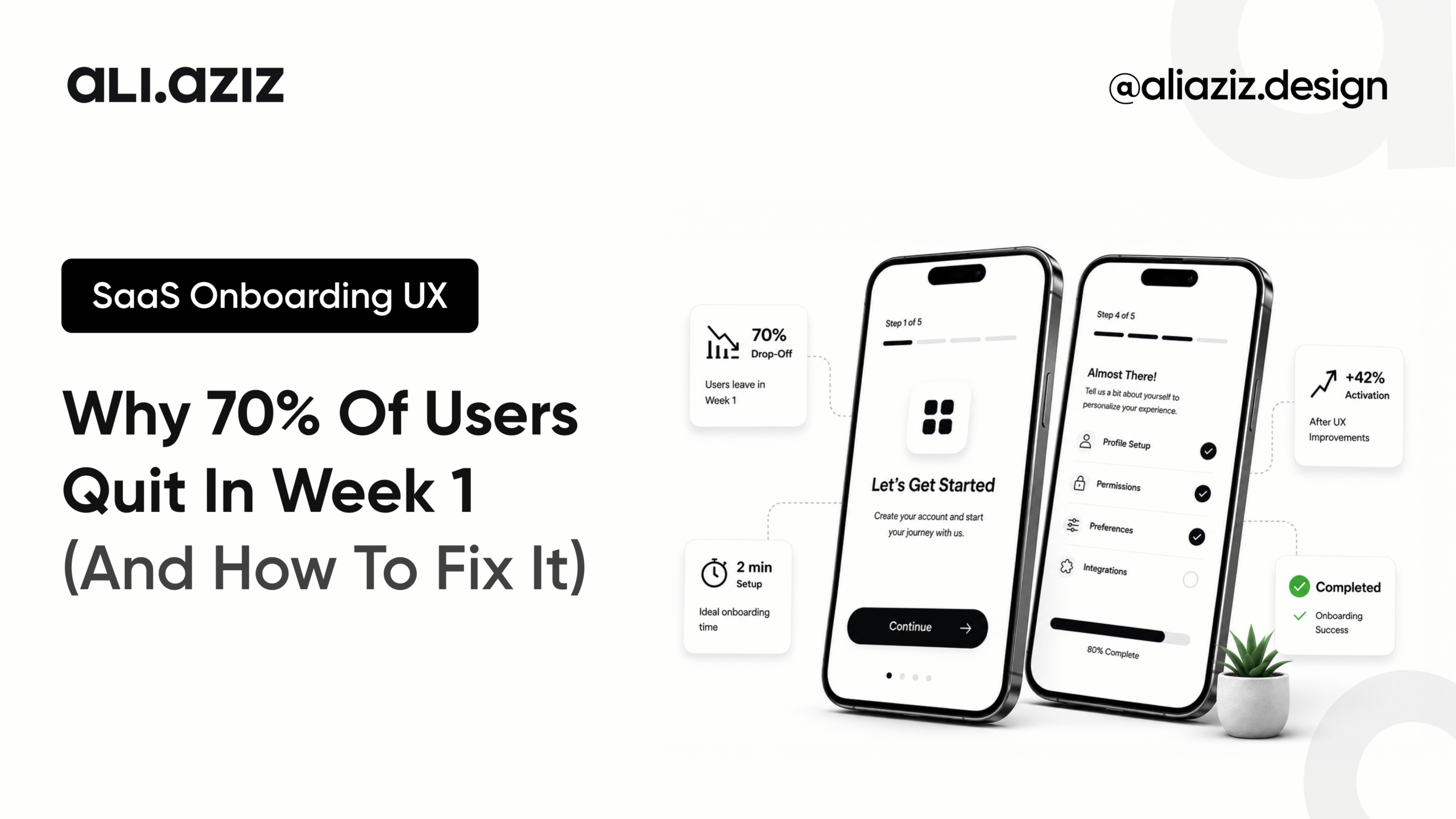
Here is a number that should make every SaaS founder uncomfortable approximately 70% of users who sign up for a SaaS product never reach the moment where they understand why they signed up. Not because your product is bad. Not because they changed their mind. Because your SaaS onboarding UX asked them to do too much before it gave them anything worth staying for.
I’ve spent ten years designing products across AI platforms, healthcare systems, and B2B SaaS. The single most predictable pattern I see in struggling products regardless of how technically impressive they are is an onboarding flow that treats the user’s first session as an intake form rather than an experience worth having.
This post is about what’s actually breaking in week one, why it breaks there specifically, and the design fixes I’ve used to move activation numbers. One of those numbers a client’s onboarding completion rate going from 31% to 58% is covered in detail below, because the principle behind it is the same one behind every onboarding problem I’ve seen.
Why Week 1 Is Where SaaS Products Win or Lose
Week one is not the start of the user journey. It’s the end of the sales process and the beginning of the retention test and most SaaS teams treat it like neither.
The mechanics of why churn concentrates in week one are straightforward. A new user arrives with a specific expectation planted by your marketing, your demo, or your landing page. They have one session maybe two to experience something that confirms that expectation before the gap between what was promised and what the product actually delivers becomes too wide to cross.
If they hit enough friction before they hit that confirmation moment, they leave. Not because they decided your product is wrong for them. Because they ran out of patience before they found out whether it was right.
The industry calls this moment time-to-first-value. I call it the point of no return. Every design decision in your onboarding flow is either compressing the time to reach it or extending the time away from it.
The 6 Onboarding UX Failures I See in Every Struggling SaaS
After auditing and redesigning onboarding flows for multiple SaaS products, the same six failure patterns appear consistently. They’re not random design mistakes. They’re structural decisions that seem reasonable during build but compound against the user in practice.
Asking for setup before delivering value
Most onboarding flows open with: choose a plan, invite your team, connect your tools, configure your preferences. All of that happens before the user has experienced a single thing that made them sign up. You’re asking for commitment before you’ve earned it. The user has no context for why these decisions matter yet so they either guess, skip, or leave.
Mistaking completeness for progress
A progress bar that reaches 100% by the time the user has connected their calendar, uploaded a photo, and named their workspace is not measuring progress. It’s measuring compliance. Real progress is: have they experienced the product’s core value? Everything else is friction dressed up as guidance.
Designing for the feature, not the outcome
Engineers build features. Onboarding should introduce outcomes. There’s a consistent mismatch I see where the onboarding flow walks users through every capability of the product in sequence when what they actually need is to understand what happens when they do the one thing they came to do. Show them the result first. The features can wait.
Requiring decisions before giving context
Choosing a workspace name, setting notification preferences, selecting a default view these decisions feel low-stakes to the product team. To a new user, they feel like commitment. And commitment feels risky when you don’t yet know if you trust the product. The principle: defer any decision that requires knowledge the user doesn’t have yet.
Treating empty states as design afterthoughts
The first screen a new user sees after completing setup is almost always empty. An empty project list. An empty dashboard. An empty feed. How that emptiness is handled is one of the highest-leverage design decisions in your entire product and most teams spend less than an hour on it. A blank screen with no guidance says ‘you’re on your own.’ A well-designed empty state says ‘here’s exactly what to do next.’
Writing for the product instead of the person
Onboarding copy defaults to product language: ‘Create your first workflow.’ ‘Configure your integration.’ ‘Define your pipeline stages.’ None of that language means anything to someone who hasn’t used the product before. Write onboarding copy from the user’s goal, not the product’s architecture. ‘Set up your first client project’ is the same instruction written in the user’s language.
The Reframe: SaaS Onboarding UX Is a Retention Problem, Not a Setup Problem
Most onboarding flows are designed by teams who are thinking about setup. Get the user configured. Get the data in. Get the integrations connected. Get them ready to use the product.
That is the wrong frame.
The goal of SaaS onboarding UX is not setup completion. It’s retained activation getting a user to the moment where they have experienced enough value that they would genuinely notice if the product disappeared. Setup is a means to that end. When teams confuse the means for the end, they build onboarding flows that are thorough, well-documented, and completely effective at driving week-one churn.
The practical consequence of this reframe is significant. Instead of asking ‘what does the user need to complete before they can use the product?’, you ask ‘what is the minimum the user needs to experience the product’s core value?’ Everything that falls outside the second question should either be removed from the first session entirely, offered as optional context, or deferred to session two.
The Redesign: From 31% to 58% Onboarding Completion
A B2B SaaS client came to me with an onboarding completion rate of 31%. By their own data, nearly seven out of ten users who started the onboarding flow were not finishing it. Their first instinct was that the flow was too long. The actual problem was different.
The flow was eight steps. Steps one through five account creation, workspace setup, team invitation, integration connection, and plan confirmation all happened before the user had seen a single screen of the actual product. By the time they reached the dashboard for the first time, they had made ten distinct decisions, typed in five different pieces of information, and had been in the product for roughly nine minutes without experiencing anything.
The redesign was based on one principle move the first experience of core value to before the first decision. Instead of setting up first and experiencing second, we showed the user what their dashboard would look like with sample data populated immediately, on step one. No commitment required. No setup needed. Just: here is what this product does.
Then we resequenced everything else. High-commitment decisions team invitations, integration connections, billing confirmation moved to session two, triggered by the user choosing to come back, not required before they’d experienced anything.
Three weeks after launch: onboarding completion moved from 31% to 58%. Not because the steps got easier. Because the sequence got honest about when commitment is reasonable to ask for.
Before vs. After: What Changed in the Flow
| Before (31% completion) | After (58% completion) |
|---|---|
| Account setup → workspace config → team invite → integrations → billing → product | Sample data dashboard shown immediately on step one — no setup required |
| 10 decisions before seeing a single product screen | First core value experience before any commitment asked for |
| High-commitment decisions (billing, integrations) in session one | High-commitment decisions deferred to session two |
| Empty dashboard as first real product screen | Pre-populated dashboard with real sample data matching user’s stated use case |
| Generic empty state: ‘Create your first project’ | Contextual prompt: ‘Here’s what your first project could look like — ready to start?’ |
| Onboarding copy in product language | Onboarding copy in user-goal language |
5 SaaS Onboarding UX Principles That Actually Move Retention
These are the principles I apply to every SaaS onboarding UX engagement. They are not theory. They come from watching the same patterns break products across different verticals and seeing the same fixes work.
1. Show before you ask
The first thing a new user should experience is the product doing something not the user doing something for the product. Use sample data, templates, or a pre-configured state to demonstrate core value before any setup decision is required. The user should feel the product’s potential before they’re asked to invest in it.
2. Define one activation moment and design toward it
Every product has a single moment where a new user thinks ‘okay, I get it.’ That moment is your activation event. For a project management tool it might be seeing a task move from in-progress to done. For an analytics platform it might be seeing their first real data point visualised. Name it. Design every step of onboarding as a path toward it and measure how long it takes users to reach it.
3. Sequence commitment to trust
Commitment should be proportional to the trust earned so far. Low-commitment decisions (choosing a colour theme, naming a project) can happen early. High-commitment decisions (billing, integrations, team access) should happen after the user has experienced value. Map every decision in your flow against the trust level it requires, then reorder accordingly.
4. Design the empty state like it’s a landing page
The first screen a new user sees after completing setup should convert them to the next action just as deliberately as your homepage converted them to sign up. It is not a blank canvas. It is an opportunity. What is the single most useful thing you can show a user who has just arrived but has no data yet? Design that.
5. Measure the right thing
Onboarding completion rate is a proxy metric. The metric that matters is retained activation: the percentage of new users who return within 72 hours. That number tells you whether your onboarding delivered value or just collected setup information. If your completion rate is high and your 72-hour return rate is low, you optimised the wrong thing.
What Good SaaS Onboarding Actually Feels Like
The best SaaS onboarding I’ve experienced and there are very few products that get this right doesn’t feel like onboarding at all. It feels like you found something that works. You open it, something happens, and you immediately understand why you signed up.
The products that do this are not necessarily the products with the most sophisticated technology. They are the products whose teams asked the right question: what is the minimum experience that would make a new user want to come back? and then designed deliberately toward that answer.
That question reframes everything. The completion bar becomes a question of whether it’s measuring the right thing. The setup flow becomes a question of whether it’s happening too early. The empty state becomes a question of whether it’s doing enough.
SaaS onboarding UX is not about making setup easier. It’s about making the case for your product in the 8 minutes your user is willing to give you before they decide whether to come back. That’s a retention problem. Design it like one.
If Your Onboarding Numbers Are Not Moving
Activation and week-one retention are among the highest-leverage metrics in any SaaS product. A 10-point improvement in onboarding completion can compound into meaningful revenue within a single quarter and it rarely requires building anything new. Most onboarding problems are sequence problems, not feature problems.
If you’re seeing high sign-up numbers and low activation, or strong trial conversion and weak week-two retention, that’s a SaaS onboarding UX problem and it’s solvable. I run structured onboarding audits that identify exactly where users are losing confidence and what changes will move the number.
Book a 30-minute onboarding audit call → Book a Call