
The brief came in on a Monday morning.
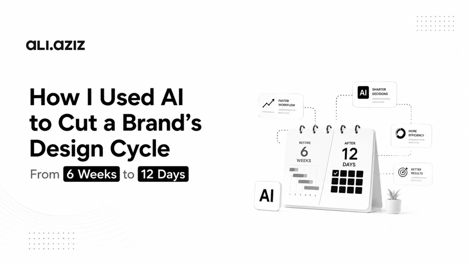
A B2B SaaS brand needed a full product redesign core screens, onboarding flow, dashboard, and a component library their engineering team could build from. The founder had been through two agencies already. Both had come back with the same answer: six weeks minimum, and that was if nothing changed mid-project.
He had eight weeks of runway left.
I told him I could do it in twelve days.
He thought I was joking. I wasn’t. But I also wasn’t going to cut anything that mattered no skipped research, no placeholder components handed to dev, no “we’ll figure out the edge cases later.” Twelve days, full quality, shipped and documented.
This is exactly what happened, and more importantly, why it worked.
First, Let’s Be Clear About What AI Actually Replaces
There’s a version of this story that sounds like: “I plugged a prompt into a tool and the design came out the other side.” That is not what happened, and if that’s what you’re expecting AI to do for your product, you’re going to be disappointed by the output and embarrassed by what you hand to engineering.
AI in a serious design process doesn’t replace thinking. It replaces time spent on things that don’t require thinking.
The hours a designer used to spend resizing components across breakpoints, generating copy variations to test in a layout, running a first-pass accessibility check on colour contrast, building out eight states of a button that time is gone now. Tools like Figma AI, Claude, and Midjourney compress tasks that used to eat half a workday into minutes.
What remains and what AI genuinely cannot do is the part that determines whether the product works at all: understanding why the product exists, who it’s for, where it’s currently breaking, and what a better version of it should feel like to use. That part still requires a senior designer who has done this many times before, across many different product types, and knows the difference between a UX problem and a business problem hiding inside a UX problem.
That’s the only reason a twelve-day cycle was possible. Not shortcuts. A cleaner process with better tools doing the parts that didn’t need to be slow.
Day 1–2: Discovery in 48 Hours Instead of Two Weeks
Traditional agency discovery takes two weeks because it’s structured around agency process, not client need. Stakeholder workshops get scheduled. Briefs get written and revised. Research plans get approved. Two weeks later, the team starts doing what they could have started on day one.
I run discovery differently.
Within the first 48 hours I needed three things: a clear picture of what the product currently does, a clear picture of where it breaks down for users, and a clear picture of what commercial outcome the redesign needs to move. Everything else is noise.
Here’s where AI changed the speed of that process in a real way.
I fed the existing product’s user flows, onboarding screenshots, and support ticket themes into Claude and ran a structured analysis: where are users dropping off, what language keeps appearing in support conversations, where does the interface contradict itself? What used to be a two-day manual synthesis job came back in forty minutes structured, prioritised, and linked back to specific screens.
That’s not magic. That’s pattern recognition applied to information I already had. But it compressed the time between “we have data” and “we know what to design” from days into hours.
By end of day two I had three things confirmed with the founder: the one metric the redesign needed to move (onboarding completion, which was sitting at 31%), the three core user frustrations driving that number, and the screens we’d touch first. That alignment which usually takes multiple back-and-forths across a week happened in a single two-hour session because I came to it with analysis already done, not a blank whiteboard.
Day 3–5: Concept to Validated Direction Without the Waiting
The longest dead time in a traditional design process is what I call the approval gap the hours or days between when a designer finishes an artifact and when a stakeholder looks at it, responds to it, and the designer can move forward.
In a six-week agency engagement, that gap happens dozens of times. Wireframes go to stakeholders. Feedback comes back two days later. Revisions happen. Another round of feedback. Then the same cycle repeats for visual design. It’s not a design problem. It’s a communication cadence problem that compounds across every single deliverable.
I eliminated it by changing what I showed and when.
By day three, using Figma AI and component scaffolding, I had three distinct directional concepts not polished, but specific enough to test a real decision. Not “here are some wireframes,” but “here is Option A which solves the onboarding problem by reducing cognitive load at the point of account setup, Option B which solves it by reordering the information architecture entirely, and Option C which keeps the current structure but redesigns the progressive disclosure model.”
Concrete options with a clear rationale get concrete responses. The founder picked Option B within four hours. Not because I pressured him, but because I gave him something worth deciding on. We moved to high-fidelity on day four.
What AI specifically enabled here was the speed of generating those three concepts. Scaffolding the component structure, generating layout variations to evaluate, producing enough visual fidelity to test real composition decisions without spending three days on pixel work all of that came together in roughly a day instead of four. The thinking behind which three directions to offer, and why, was still mine. But the execution speed meant I could think at a higher level without losing detail.
Day 6–9: High-Fidelity Design and the Component Library
This is where most designers hit their real bottleneck, and where AI made the most dramatic difference to the timeline.
Building a production-ready component library from scratch used to take the better part of a week. Button states, form inputs, modals, notification patterns, empty states, loading states, error states, data tables, navigation variants by the time you’ve built every component your engineers are going to need, you’ve spent days on work that is fundamentally systematic rather than creative.
Using Figma AI’s component generation alongside my existing design system framework, I compressed that work substantially. I generated the base component set, audited it for consistency, applied the brand tokens we’d defined, and documented usage rules for each component. Work that would typically span three to four days happened across one and a half.
That freed four days for the work that genuinely required design judgment: the onboarding flow, the dashboard information architecture, and the empty state and error patterns that most projects get wrong because they’re treated as afterthoughts rather than core design problems.
The onboarding flow is where I spent the most deliberate time. At 31% completion, the product wasn’t failing because of bad visual design it was failing because it was asking users to make decisions before they had enough context to make them confidently. We resequenced the entire flow to defer the high-commitment decisions (team setup, integrations, billing confirmation) until after a user had experienced the product’s core value. That’s not an AI decision. That’s a decade of watching onboarding flows fail in similar ways and knowing which pattern to reach for.
By day nine, every screen was done, annotated, and handed to engineering with a Figma link, a component documentation page, and a three-page interaction spec.
Day 10–12: Review, Iteration, and Close
The last three days were for what I call pressure-testing going through every screen with fresh eyes, every edge case with the engineering lead, every copy string with the founder. Not to change the direction, but to find the ten things that are always wrong in any design no matter how carefully it was built.
There were eleven, in this case. Three interaction edge cases we hadn’t accounted for. Two component behaviours that would have caused dev headaches. Four copy strings that were technically accurate but tone-deaf in context. One spacing inconsistency across breakpoints that would have made the mobile experience feel unfinished.
All eleven fixed before a single line of code was written.
That final review process doesn’t compress. It shouldn’t. It’s the stage where you earn the quality of the thing you’ve built, and skipping it is how you end up with a twelve-day sprint that looks fast but costs two months of post-launch fixes.
By day twelve, the founder had a complete, production-ready design system, the full product redesign, and annotated specs for engineering. His team started building on day thirteen.
What Actually Made This Possible
It wasn’t the AI tools, though they mattered. It was the combination of three things that only work together:
Clarity before execution. The forty-eight hour discovery process wasn’t fast because I rushed it. It was fast because I knew exactly what information I needed and went after only that. Most projects take two weeks in discovery because the designer doesn’t know what they’re looking for yet.
Senior judgment applied at every decision point. The reason AI compressed the execution time without degrading the quality is that it was applied to systematic tasks while a senior designer made every creative and strategic call. AI generated the component scaffold; I decided which components the product actually needed. AI surfaced the onboarding data patterns; I decided which pattern mattered enough to change.
A communication cadence that eliminated waiting. The approval gap killed the timeline in every agency engagement I’ve seen. Running discovery to a conclusion before showing work, showing specific options instead of open-ended wireframes, and structuring feedback sessions around real decisions rather than general impressions that’s what kept the twelve-day pace without the founder feeling out of control of his own product.
The tools change. The principles don’t.
What Happened After Launch
Three weeks after the engineering team shipped the redesign, onboarding completion had moved from 31% to 58%. Not because the new design was prettier because it was solving the right problem in the right order.
That’s the number that matters. Not the twelve days, not the AI workflow, not the component library. A business metric moved because the design was built around moving it.
If your product is losing users at onboarding, or your current design process feels slower than it should, or you want to understand whether an AI-augmented approach would work for your specific product — that’s exactly the conversation a discovery call is for.
Ali Aziz is a senior freelance product designer and Toptal Top 3% designer specialising in AI tools, Web3, SaaS, and healthcare UX. He has designed 15+ digital products for clients in the US, UK, UAE, and beyond. See the work at aliaziz.design or read about how he works on the About page.