
Here is the uncomfortable truth about every AI product shipping right now: it will be wrong. Not occasionally, not in edge cases, not in unusual conditions regularly, predictably, and in front of your users. The model will misread context. The output will miss the intent. The confidence will be misplaced. This is not a bug waiting to be fixed. It is a property of how current AI systems work, and it is not going away.
The question is not how to prevent AI failure UX from happening. The question is how to design around it so that when the AI gets something wrong and it will users stay calm, stay in the product, and trust the system enough to try again.
I designed RevelAI’s conversational interface for over 2,000 clinical users people using AI to retrieve medical information during active patient care. In that context, an AI failure is not an annoyance. It is a clinical risk. The entire interface had to be designed around the assumption that the AI would sometimes be wrong, and that the user needed to know when to trust it, when to question it, and how to recover when it failed.
What I learned in that project shaped how I think about AI failure UX across every vertical I’ve worked in since. This post is the full framework.
Why AI Failure Is a Design Problem, Not an Engineering Problem
Most product teams treat AI errors as an engineering responsibility. The model got it wrong fix the model. The output was hallucinated improve the training data. The confidence was miscalibrated tune the scoring. All of that work matters. None of it solves the UX problem.
The UX problem is this: users do not know how to calibrate their trust in AI systems. They either over-trust accepting AI output without scrutiny because the interface presented it with false certainty or they under-trust abandoning the feature entirely after a single bad experience. Neither behaviour serves them well. And both are design failures, not model failures.
The data is stark. Only 16% of people globally trust AI a great deal for accurate information, according to Google and Ipsos research. 42% of companies abandoned most of their AI projects in 2025, up from 17% the previous year, according to Capicua’s industry analysis. Nielsen Norman Group’s State of UX 2026 identifies trust as the defining design challenge of this year specifically because users now have enough experience with AI products to have developed informed scepticism.
That scepticism is not a barrier to adoption. It is a design brief. Users who have been burned by an AI feature are more hesitant to adopt new ones but they are not gone. They can be won back with an interface that is honest about what the AI can and cannot do, gives them control when it matters, and handles failure in a way that preserves rather than destroys their confidence.
| The AI trust gap in 2026 — by the numbers 88% of organisations use AI in at least one function — McKinsey State of AI, 2026 <10% have actually scaled it to deliver measurable value — McKinsey State of AI, 2026 78% of consumers say explicit AI content labelling is very important to their trust — Gartner Consumer Survey, 2025 16% of people globally trust AI a great deal for accurate information — Google / Ipsos 42% of companies abandoned most AI projects in 2025, up from 17% the prior year — Capicua industry analysis The gap between these two realities widespread AI deployment and near-absent user trust is a design problem. |
The 3 Types of AI Failure Your UX Must Account For
Not all AI failure UX is the same. Before you can design for failure, you need to know which type of failure you are designing for because each one requires a different response from the interface.
Type 1 — Confident wrong answers (the most dangerous)
What it looks like: The AI produces output that is wrong, but presents it with the same visual confidence as output that is right. No caveat, no uncertainty signal, no way for the user to tell the difference. This is the failure mode that caused lawyers to submit AI-generated legal citations that didn’t exist the interface treated hallucinated output identically to verified output.
Why it’s the most dangerous: Users who over-trust AI output are not protected by the interface. And when the error surfaces later in a client deliverable, a clinical decision, a financial report the damage to trust is not just in the AI feature. It extends to the entire product.
Type 2 — Uncertain output presented as definitive
What it looks like: The AI is working with incomplete context, ambiguous input, or a query that sits at the edge of its training. Its output is probabilistic a reasonable guess, not a reliable answer. But the interface presents it without any signal of that uncertainty, leaving the user to assign their own confidence level without any guidance.
Why it matters: Probabilistic outputs need probabilistic presentation. Presenting ‘This may be the flu’ as ‘You have the flu’ is not just a copy problem it’s a design philosophy problem. The interface should communicate the AI’s actual confidence, not flatten it into false certainty for the sake of a cleaner UI.
Type 3 — Silent failure
What it looks like: The AI fails to complete the task returns nothing, returns an error, times out, or produces output so degraded it is unusable but gives the user no useful information about what happened or what to do next. A ‘Something went wrong’ message with no recovery path, no explanation, and no alternative.
Why it matters: Silent failure is not neutral. It is the worst possible user experience because it leaves the user with no information, no agency, and no reason to believe trying again will be different. According to research compiled by UZER and Nielsen Norman Group, vague error messages with no recovery path are among the most common AI UX mistakes and one of the most damaging to long-term adoption.
The 7 UX Patterns for AI Failure — The Full Framework
These are the patterns I use on every AI product engagement. They are not theoretical they come from designing clinical AI interfaces, conversational AI tools, and AI-assisted workflows where failure has real consequences. Some of them are simple. Most of them are ignored.
Pattern 01: Confidence signalling — show the AI’s certainty, not just its answer
The most important principle in AI failure UX is that users should never have to guess how confident the AI is in its output. If the AI is highly confident, the interface can present the result clearly. If the AI is uncertain, the interface must signal that uncertainty visually, in copy, or both.
How to implement it: Confidence indicators don’t need to be complex. A three-level system works for most products:
high confidence (result presented clearly, no caveat),
medium confidence (result presented with a short uncertainty note ‘Based on the information available, this is likely…’ or a visual indicator like a partial-fill icon), low confidence (result presented as a starting point, with an explicit invitation to verify ‘This is an estimate please review before using’). The key principle: never present a probabilistic output with deterministic formatting.
| From the field:On RevelAI’s clinical interface, AI-retrieved information was displayed with a confidence tier that clinical staff could see at a glance. High-confidence outputs matched the visual weight of the surrounding interface. Lower-confidence outputs appeared with a distinct visual treatment and a ‘verify before acting’ prompt. Adoption was measurably higher in units where this distinction was clear, because staff trusted the signal. |
Pattern 02: Correction affordance — make it obvious the user can fix it
Users who know they can correct an AI are measurably more willing to engage with it. The ability to override, edit, or reject AI output is not a fallback mechanism it is a trust signal. According to UX research cited by reloadux.com, correction affordance is one of the three most impactful patterns for building sustained AI adoption.
How to implement it: Every AI output should have a visible mechanism for correction an edit button, a ‘this is wrong’ flag, a thumbs down that does something meaningful. The correction action should be one tap or click away, not buried in a settings menu. And critically: when a user corrects AI output, the interface should acknowledge that correction with feedback. ‘Got it I’ll use this instead’ signals that the correction was heard. Silence signals it was ignored.
| From the field: The worst version of this pattern is an AI feature with no correction mechanism at all output you can read but cannot challenge. The next-worst version is a correction mechanism so buried that users don’t know it exists. Good correction affordance is present, visible, and responsive. |
Pattern 03: Graceful error states — the failure screen is a trust moment
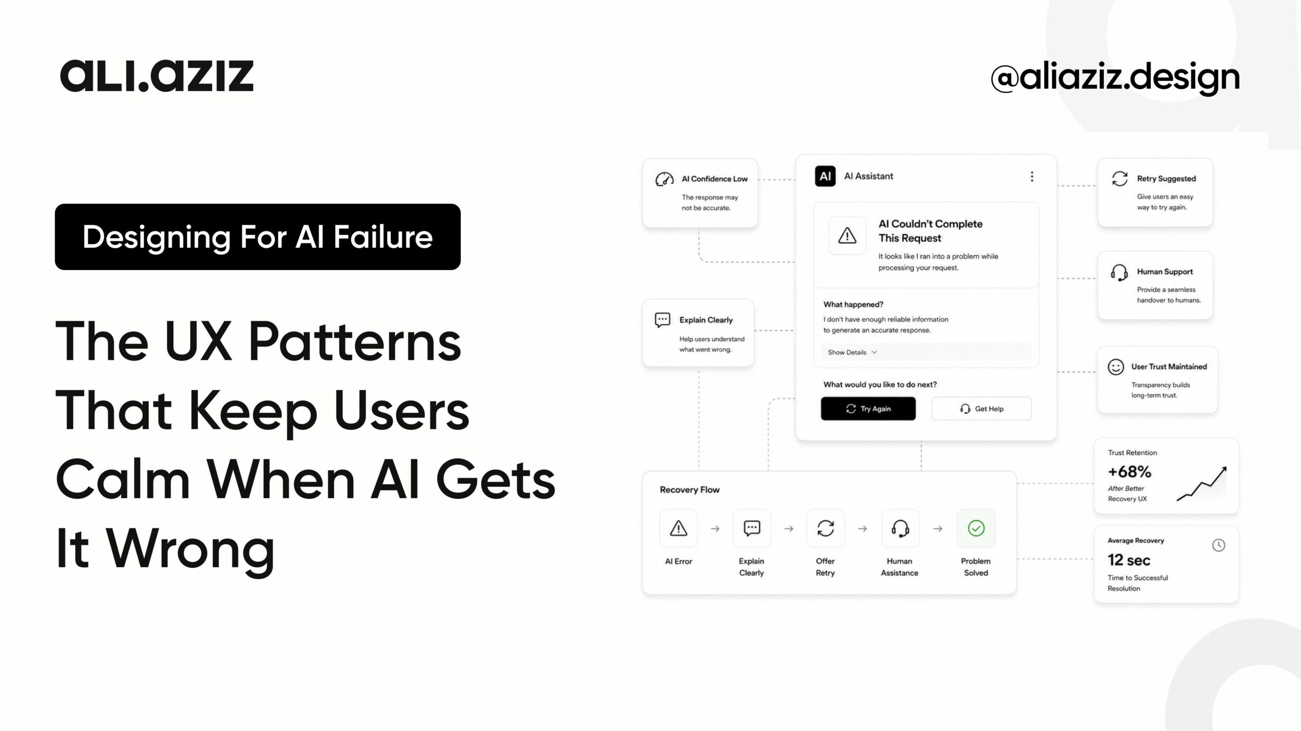
When an AI feature fails to complete a task timeout, error, unusable output the failure screen is not a dead end. It is a trust moment. How the interface handles that moment determines whether the user tries again.
How to implement it: A good AI error state has four components:
(1) An honest explanation of what happened not a technical error code, but a human-language explanation of why the AI couldn’t complete the request.
(2) What the user can try next a specific action, not a generic ‘please try again.’
(3) An alternative path if the AI can’t complete the task, where can the user go to accomplish the same goal manually?
(4) An acknowledgment that this is a known limitation, not a system failure ‘This type of query is outside what I can reliably answer. Here’s how to find this another way.’
| From the field: The single most damaging error pattern I see in AI products ‘Something went wrong. Please try again.’ No explanation. No alternative. No next step. That message is not an error state it is a trust terminator. Every AI product has a version of this error. Almost none of them have a good version of it. |
Pattern 04: Expectation framing — set the right ceiling before the AI speaks
Most AI trust problems begin before the AI produces a single word of output. They begin in the marketing copy, the onboarding flow, and the feature introduction where ‘AI-powered’ is presented as synonymous with ‘accurate’, ‘intelligent’, or ‘always right’. Users arrive with a ceiling that no AI system can consistently meet, and every failure confirms the gap.
How to implement it: Expectation framing is not about lowering the perceived value of your AI feature. It is about setting the right kind of expectation one the feature can consistently meet.
‘AI-assisted’ is more honest and more sustainable than ‘AI-powered.’
‘Suggested by AI always verify’ is more trustworthy than ‘AI answer.’
The framing should communicate: here is what this feature is good at, here is where it needs your judgment, here is how to get the best out of it.
| From the field: The products that lose users fastest are the ones where the gap between the marketing promise and the actual AI behaviour is widest. Setting honest expectations in the onboarding and feature introduction is the cheapest trust investment a product team can make and the most consistently skipped. |
Pattern 05: Human-in-the-loop moments — give users control at the right time
For AI features that take consequential actions sending messages, making changes, processing data the interface should give users a review moment before the action completes. Not on every action (that training users to click through without reading is its own failure), but on high-stakes actions proportional to their stakes.
How to implement it: The design principle here is stakes calibration: the higher the consequence of the AI action, the more visible the human review moment. A typo correction in a text editor needs no confirmation. A draft email sent on the user’s behalf needs a review step. A data deletion or financial transaction needs an explicit confirmation with a summary of what is about to happen. Frequency and stakes must be calibrated together a verification prompt appearing every few seconds trains users to dismiss it without reading. A verification prompt appearing at the right moment, on a genuinely consequential action, builds the habit of careful engagement.
| From the field: On agentic AI products where AI takes actions rather than just producing outputs this pattern is the most critical in the entire framework. Every action the AI takes autonomously should have a corresponding audit trail the user can review, and a reversal mechanism they can use. ‘Undo’ is a trust feature in AI products. |
Pattern 06: Transparent sourcing — show where the answer came from
One of the most effective AI failure UX patterns is also one of the most underused: showing users where the AI’s output originated. When users can see the source of an AI’s reasoning the document it searched, the data point it used, the context it was given they can evaluate the output themselves rather than taking it on faith.
How to implement it: Transparent sourcing does not require exposing technical implementation details. It requires connecting the output to the input the user can recognise. ‘Based on the document you uploaded’ is more trustworthy than a generic AI answer.
‘From the Q3 report you shared’ is more actionable than ‘Based on available data.’ The sourcing should be specific enough to be verifiable. If the user can check the source and confirm the output is grounded in something real, their trust in the output and in the system goes up.
| From the field: On the AI knowledge base I designed for 2,600+ internal users, every AI-retrieved answer was accompanied by the source document name and the relevant section. Users who could verify the source engaged with AI features at significantly higher rates than those presented with unsourced output because the mechanism for verification was there even when they chose not to use it. |
Pattern 07: Progressive trust building — earn it before you ask for it
Trust in an AI system is not established in a feature introduction or an onboarding screen. It is built through repeated interactions where the AI performs as expected and specifically, through interactions where the AI acknowledges its limits before the user discovers them independently.
How to implement it: Progressive trust building means starting an AI feature with low-stakes, high-accuracy use cases and expanding its scope as the user’s trust in the system accumulates. It means designing the first five interactions the user has with an AI feature to be the ones the system is most reliably good at. It means building explicit feedback mechanisms thumbs up/down, edit/accept rates, flag counts and using those signals to surface AI limitations to the product team before users vote with their feet.
| From the field: The trust trajectory of most AI products is backwards: they launch with the most ambitious capabilities first, accumulate early failures in the highest-stakes use cases, and then try to rebuild trust from a deficit. The products with the strongest long-term AI adoption are the ones that started with the use cases where the AI is genuinely reliable, built trust through those wins, and expanded scope as the user’s confidence in the system grew. |
What Designing for AI Failure Actually Looks Like in Practice
On the RevelAI engagement, designing for AI failure was not a secondary concern it was the primary design constraint. Clinical staff using AI during patient interactions have zero tolerance for confident wrong answers and limited patience for silent failures. The entire interaction model was built around one question: what does the interface need to show so that a clinician can decide in three seconds whether to trust this output?
The answer was four things, all present on every AI output: the confidence level (displayed as a visual tier, not a percentage), the source (the specific document or data type the AI used), the recovery action (one tap to search manually if the result looked wrong), and the verification prompt (a contextual cue on lower-confidence outputs that recommended checking a secondary source).
The result was a 3x improvement in the speed of information retrieval not because the AI was dramatically more accurate, but because clinical staff trusted the interface enough to use the AI output as a starting point rather than ignoring it entirely. Trust moved the metric more than model performance did.
That is the practical case for investing in AI failure UX. You cannot ship a perfect AI. You can ship an interface that makes imperfection navigable and in doing so, you get users who stay, engage, and eventually trust the system enough to let it improve over time.
| Design pattern | What it protects against | How to verify it’s working |
|---|---|---|
| Confidence signalling | Over-trust of wrong output | Track override rate users correcting AI = system working |
| Correction affordance | Users abandoning on first failure | Track edit/reject rate and re-engagement after corrections |
| Graceful error states | Silent failure destroying trust | Track retry rate after errors above 40% means the error state is working |
| Expectation framing | Gap between promise and performance | Measure NPS difference between users who completed onboarding vs skipped it |
| Human-in-the-loop | Consequential AI actions without review | Audit reversal rates if users rarely reverse, the confirmation step is proportionate |
| Transparent sourcing | Unsupported AI outputs eroding credibility | Track feature adoption among users who engage with source citations vs those who don’t |
| Progressive trust building | Early failures killing long-term adoption | Track 30-day feature retention split by first-session success rate |
The Principle Behind All 7 Patterns
Every pattern above comes back to the same principle AI failure UX is not about hiding the failure. It is about designing the interface so that failure is legible, recoverable, and honest.
Legible means the user understands what happened not in technical terms, but in terms of what it means for them and what they should do next. Recoverable means there is a clear path forward that does not require the user to start from scratch. Honest means the interface does not overstate the AI’s certainty or capabilities in order to avoid a difficult conversation with the user.
The products that build lasting AI adoption in 2026 will not be the ones with the most accurate models. They will be the ones with interfaces that make imperfect models navigable. 88% of organisations have deployed AI. Fewer than 10% have scaled it to deliver measurable value. The gap between those two numbers is not an engineering gap. It is a design gap.
Design it deliberately, starting with AI failure UX.
If You’re Building an AI Product in 2026
The AI product landscape is full of features that work well in demos and fail in production not because the model is wrong, but because the interface never accounted for the moments when the model is wrong. Getting AI failure UX right is the difference between an AI feature that compounds trust over time and one that burns it on the first bad output.
I work with teams building AI-first products to design interfaces that earn the trust they need to scale. If your AI product has strong underlying capabilities but is struggling with user adoption, an AI UX audit will identify exactly where the trust breakdown is happening and what to redesign.
Book a 30-minute AI UX discovery call → Book a Call
Ali Aziz is a senior AI product designer and Toptal Top 3% designer specialising in AI tools, Web3, SaaS, and healthcare UX. He designed the conversational AI interface for RevelAI, used by 2,000+ clinical users, and has shipped AI features across healthcare, enterprise, and B2B SaaS products. See the work at aliaziz.design or read how he approaches AI product design on the About page.
Related reading: How I Used an AI Design Process to Cut a Brand’s Design Cycle From 6 Weeks to 12 Days
Related reading: The Designer’s New Role: How AI Is Reshaping Design and Redefining Success
Related reading: SaaS Onboarding UX: Why 70% of Users Quit in Week 1
Frequently Asked Questions
AI failure UX refers to the design patterns and interface decisions that determine how a product behaves when its AI features produce wrong, uncertain, or incomplete output. Good AI failure UX ensures users understand what went wrong, can recover from the failure, and have enough confidence in the system to continue using it. Bad AI failure UX presents failures without explanation, leaves users with no recovery path, or overstates the AI’s certainty in a way that erodes trust over time.
Most AI products are built and marketed around capability what the AI can do when it works well. Error states and failure scenarios are treated as edge cases to be minimised rather than core design problems to be solved. The result is AI features that perform well in demos and in product reviews but lose users in production, where AI limitations surface regularly. The fundamental issue is that most teams have not treated AI failure as a UX design problem they have treated it as an engineering problem, and waited for the model to improve rather than designing the interface to handle imperfection.
A confident wrong answer is when an AI produces incorrect output and presents it with the same visual confidence as correct output giving the user no way to tell the difference. This is the most damaging failure mode because users who act on confidently wrong AI output discover the error later, often at significant cost. A silent failure is when the AI fails to complete a task entirely and gives the user no useful information about what happened or what to do next. Both are serious UX failures, but they require different design responses: confident wrong answers are addressed through confidence signalling and correction affordance; silent failures are addressed through graceful error states and clear recovery paths.
Confidence signalling is a design pattern that makes the AI’s certainty level visible to the user. Rather than presenting all AI output with identical visual treatment regardless of how reliable it is, confidence signalling uses visual cues, copy, or explicit indicators to show users when the AI is highly confident and when it is uncertain. A simple three-level system works for most products: high confidence (result presented clearly), medium confidence (result with an uncertainty note), and low confidence (result presented as a starting point with an invitation to verify). The core principle is that users should never have to guess how reliable an AI output is.
An effective AI error state has four components:
(1) An honest explanation of what happened, in plain language rather than technical error codes.
(2) A specific next step the user can take — not a generic ‘please try again’ but a concrete action.
(3) An alternative path — if the AI cannot complete the task, where can the user go to accomplish the same goal another way?
(4) An acknowledgment that this is a known limitation rather than a system breakdown.
The message ‘Something went wrong’ with no further information is not an error state it is a trust terminator that gives the user no reason to believe the next attempt will be different.
Correction affordance is the design principle that every AI output should have a visible, accessible mechanism for the user to edit, reject, or flag the result. Research consistently shows that users who know they can correct an AI are more willing to engage with it the ability to correct is itself a trust signal, not just a fallback. Correction affordance should be one tap or click away from the AI output, not buried in settings, and the interface should acknowledge when a correction is made rather than responding with silence.
Human-in-the-loop design means building review moments into AI features that take consequential actions moments where the user can verify, approve, or cancel what the AI is about to do before it does it. The key design principle is stakes calibration: the higher the consequence of the AI action, the more visible and deliberate the human review moment should be. A typo correction needs no confirmation. An email sent on the user’s behalf needs a review step. A financial transaction or data deletion needs an explicit confirmation with a summary of the action. Human-in-the-loop design also means building an audit trail and reversal mechanism for every consequential AI action.
Transparent sourcing improves AI trust by connecting the AI’s output to input the user can recognise and verify. When a user can see that an AI answer came from a specific document, dataset, or data source they provided, they can evaluate the output against the source rather than taking the AI’s word for it. This verification mechanism even when users choose not to use it increases trust because it demonstrates that the AI’s reasoning is grounded in something real. Unsourced AI output that arrives without any explanation of where it came from is harder to trust, regardless of its actual accuracy.
Yes. The stakes of an AI error vary significantly by industry, and the design response should be proportionate to those stakes. In healthcare, a wrong AI output can contribute to a clinical decision error states need to be highly visible, recovery paths need to be fast, and confidence signalling needs to be unambiguous. In a creative tool, a wrong AI output is a minor inconvenience a lighter error treatment is appropriate. The principles are the same across industries: legible, recoverable, and honest. The design expression of those principles should be calibrated to the consequence of failure in that specific context.
There are four metrics that reliably indicate whether AI failure UX is performing well:
(1) Override/edit rate the percentage of AI outputs users correct or replace. A healthy rate suggests users are engaging critically rather than blindly accepting or completely abandoning AI output.
(2) Retry rate after errors if users try again after an AI failure, the error state gave them enough information and confidence to continue. A retry rate above 40% suggests the error state is functioning well.
(3) 30-day feature retention users who stay engaged with an AI feature after 30 days have built enough trust in the system to tolerate its imperfections.
(4) Feature adoption spread AI features that earn trust spread through word of mouth within organisations. Stagnant adoption often indicates a trust problem rather than a feature discovery problem.